How Dangerous Is Your Street? Find Out With New Traffic Fatality Maps (video)

Share
Ever wonder how safe that street corner is you cross or turn at every day on your way to work? It seems busy, sure, but you’ve never actually seen an accident, much less anyone killed. You might’ve suspected, assuming you’d heard of it, that the information was available in the Fatality Analysis Reporting System (FARS) put out by the US National Highway Traffic Safety Administration but don’t have the time to sift through all their complicated data tables. Well UK-based transport data mavens ITO World has just done the heavy lifting for us, compiling vast amounts of traffic fatality data from multiple websites and putting it into a format that’s as intuitive as Google Maps.
It’s the old tables and charts age catching up with the web interface technologies of today. And it’s really cool.
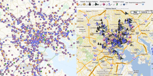
Right now ITO World has created maps for the US and the UK, and are currently working on a map for Canada. The data from the US is taken from FARS and includes all fatalities between January 1, 2001 and December 31, 2009. Icons with the age and sex of the victim, whether they were driving a motorcycle or other vehicle, cycling or walking, and the year they were killed are shown. You type in a location and the icons will populate the area. It can’t use street addresses (yet?) but I found my street pretty easily once hovering over Baltimore. The turn close to my house is quite treacherous and I usually take a longer way around just to avoid it. I’d actually expected more icons at the turn, but was pleasantly surprised. Staring at the map, though, I was reminded of another location-based statistics map the city generates.
Rather than satisfying a morbid curiosity, can the augmented reality of traffic fatalities make a difference in how we drive, how we cross busy intersections? That’s the hope of Russia’s Ministry of Internal Affairs. Doing one better than ITO World, they’ve created an app that allows people with smartphones to walk the streets and see what traffic-related injuries and deaths occurred on the streets before them. It’s quite macabre, actually. Here, take a look.
Be Part of the Future
Sign up to receive top stories about groundbreaking technologies and visionary thinkers from SingularityHub.


Morbid yes, and spooky, like a paranormal camera to visualize spirits of the dead. But it’s utility is clear. Maybe something like an ambient, color-coded light could be incorporated into our GPS devices so that when we approach an unfamiliar and dangerous intersection it turns red, and heightens our attention.
As going from DOS to Windows showed us, user-friendly, visually-based interfaces are vastly preferable to lines of code or tables of complex data. Efforts like ITO World’s are badly needed if augmented reality is going to become a ubiquitous tool instead of just a cool app.
[image credits: ITO World and Crime Baltimore]
[video credit: LeoBurnettWorldwide via YouTube]
image 1: US
image 2: UK
image 3: Baltimore
video: Moscow
Peter Murray was born in Boston in 1973. He earned a PhD in neuroscience at the University of Maryland, Baltimore studying gene expression in the neocortex. Following his dissertation work he spent three years as a post-doctoral fellow at the same university studying brain mechanisms of pain and motor control. He completed a collection of short stories in 2010 and has been writing for Singularity Hub since March 2011.
Related Articles

Hugging Face Says AI Models With Reasoning Use 30x More Energy on Average

How Scientists Are Growing Computers From Human Brain Cells—and Why They Want to Keep Doing It

Study: AI Chatbots Choose Friends Just Like Humans Do
What we’re reading

