This Amazing Interactive Map of the Universe Takes You All the Way Back to the Big Bang
Share
The early 2020s have been a chaotic time, with seemingly one crisis after another befalling humanity: the Covid-19 pandemic, inflation and supply chain upheaval, political instability and extremism, climate change...the list goes on. But what does it all really mean, or matter, when you zoom out and look at the big picture?
An astronomy professor from Johns Hopkins University has given us the chance to zoom way out in both time and space with an interactive map of the observable universe. Exploring it can quickly put not only our problems, but our lives, this century, Earth, and our entire galaxy into stunning (and somewhat unsettling) perspective.
“In this map, we are just a speck at the very bottom, just one pixel. And when I say we, I mean our galaxy, the Milky Way which has billions of stars and planets,” said map creator Brice Ménard. “We are used to seeing astronomical pictures showing one galaxy here, one galaxy there or perhaps a group of galaxies. But what this map shows is a very, very different scale.”
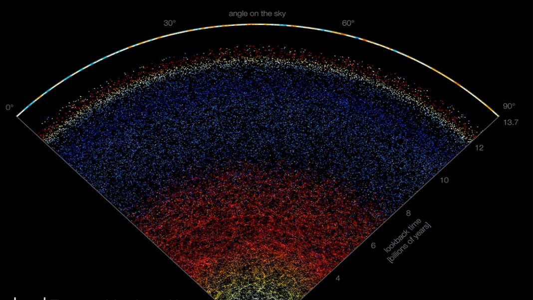
The map depicts the position of 200,000 galaxies, using different colors to show how far away they are and how long it has taken for their light to reach telescopes on Earth. Specifically, a telescope at Apache Point Observatory in New Mexico, where the Sloan Digital Sky Survey recorded data from various segments of the night sky since 2000.
The full map, the website explains, is a sphere, but it’s not possible to show all of its data in a two-dimensional representation. The online map shows a slice of the sphere that’s about 10 degrees wide.
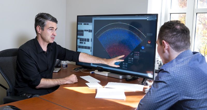
Brice Ménard (left) and Nikita Shtarkman examine the map of the observable universe. Image Credit: Will Kirk/Johns Hopkins University
Scrolling up from the speck of the Milky Way at the bottom of the map, you first encounter other spiral galaxies depicted in light blue. Spiral galaxies are made up of a bright nucleus surrounded by a flat, rotating disk of stars; about 70 percent of the galaxies closest to the Milky Way are spirals.
Be Part of the Future
Sign up to receive top stories about groundbreaking technologies and visionary thinkers from SingularityHub.

Continuing to scroll upwards—that is, farther back in time—you next see elliptical galaxies in yellow. These are the most abundant type of galaxy in the universe, but the orbits of their stars are random and elongated rather than rotating around a fixed center point. Their stars are much older than those in spiral galaxies; astronomers think elliptical galaxies were formed when spiral galaxies crashed into each other and merged.
Around four billion years ago, you hit redshifted elliptical galaxies (“as the universe expands, photons gets stretched and objects appear redder. This is the case for the elliptical galaxies,” the sidebar explains), followed by quasars (massive black holes at the centers of distant galaxies), redshifted quasars, and at last, the edge of the observable universe: an actual photograph of the first flash of light emitted after the Big Bang.
The light travel time to Earth of anything beyond this point, the map says, is greater than the age of the universe. How’s that for perspective?
It seems Menard’s concern, though, wasn’t as much to provide said perspective but rather to simply show how fascinating the universe is.
"Astrophysicists around the world have been analyzing this data for years, leading to thousands of scientific papers and discoveries. But nobody took the time to create a map that is beautiful, scientifically accurate, and accessible to people who are not scientists,” he said. “Our goal here is to show everybody what the universe really looks like."
Image Credit: B. Ménard and N. Shtarkman/Johns Hopkins University
Related Articles

Spaceflight Nears Its Steamship Era

The Milky Way Was Rewired by a Cataclysmic Collision Billions of Years Ago. Now It Is on Course for Another.

Orbital Data Centers Are Seductive on Paper, but They Face Daunting Challenges in Reality
Spaceflight Nears Its Steamship Era
The Milky Way Was Rewired by a Cataclysmic Collision Billions of Years Ago. Now It Is on Course for Another.
Orbital Data Centers Are Seductive on Paper, but They Face Daunting Challenges in Reality
What we’re reading