Gapminder Makes Statistics Awesome – Now On Your Desktop (video)
Share
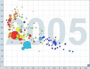
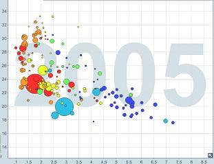
It's probably the experimental physicist in me speaking, but there are few things I find sexier than a good graph. In that sense the Gapminder Foundation is positively pornographic. Gapminder presents important global data in clear graphs that move dynamically so that you can watch the history of the world unfold through the magic of statistics. The Gapminder graphs are built on a platform called Trendalyzer (which was sold to Google in 2007) and use data from a variety of global institutions like the OECD, World Bank, and the International Labor Organization. Gapminder is free to use and you can share graphs easily with bit.ly links. Now, Gapminder is available for you to download as well, so you can use all of that yummy data in your own presentations and educational lessons. We've got some great videos of Gapminder's statistical prowess in the videos below featuring director Hans Rosling.
The modern world is awash in data, and it's only going to get worse. We are trending towards increasing information from a variety of sources - everything from military drones to lifelogging. Add in the Internet of Things or brain simulations and it gets truly ridiculous. Data without understanding is pretty much useless so as these sources of information grow we will need improved methods of analysis and presentation. Gapminder is a step in the right direction. It puts some of the most important public data in a format that is instantly influential. We've already seen it put to excellent use during Hans Rosling's presentations at TED, but here's another Rosling video demonstrating the clear and quick insight that Gapminder's graphs can provide:
If you're a fan of data analysis (who isn't really?) then you probably know that Gapminder is not the only source of this kind of statistical presentation. We've already shown you Google's Public Data Explorer, which greatly resembles Gapminder in form and function. That makes sense considering Google uses parts of Trendalyzer for its PDE. There's also Wolfram Alpha, which is as powerful if not as beautiful, and we could even include in this field automated journalists which transform sports stats into stories. Gapminder stands out, however, as having the cleanest looking UI, and now it also stands out because it is easily (and freely) downloaded to your home computer. Gapminder Desktop will even update your data regularly so that your info is always current. You no longer need an internet connection to play God with statistics. Here's Rosling to explain how to use the program (I love the presentation tips at 2:45):
Be Part of the Future
Sign up to receive top stories about groundbreaking technologies and visionary thinkers from SingularityHub.

As much as I like the new desktop version of Gapminder, it has some imperfections that are hard to ignore. Most importantly, it doesn't let you export the graphs you bookmark (more or less create) in the program. I want to embed my Gapminder graph into a powerpoint presentation, not switch to it in the middle of my talk. I realize that such functionality may take time to develop, but I'd love for it to be here sooner rather than later. Second, Gapminder is really only built to present it's own data. If you want to make graphs based on your own spreadsheets, you basically have to go through Google's Motion Chart. Which is a fine program, but it needs internet connectivity. Finally, Gapminder Desktop uses Adobe AIR, which can be a little glitchy depending on your OS.
Even with these imperfections I'm very much in favor of Gapminder. Not just for the clear presentations it enables, but for its whole philosophy. Hans Rosling and colleagues started the Gapminder Foundation because of the perceived 'gap' between the worldwide collection of data and the general lack of public comprehension. They want publicly funded data to be shared and understood among the public, and that's something I can really get behind. The more we understand global trends, the better we'll be able to understand our current needs, and the greater our chances of using accelerating technologies to satisfy them. We live in an age of data and any program that democratizes that data is a positive tool. Gapminder is good stuff.
Oh, and if you need proof that graphs can be titillating, here's another Rosling video for you. Sex, money, Swedish women - it has it all:
[image and video credit: Gapminder/GapCast]
[source: Gapminder.org]
Related Articles

Toxic Clumps in Huntington’s Disease May Protect the Brain Too

AI Can Now Design and Run Thousands of Experiments Without Human Hands. We Aren’t Ready for the Risk to Biosecurity.

Three Countries Own the Lithium Market. An MIT Startup Wants to Break Their Grip.
Toxic Clumps in Huntington’s Disease May Protect the Brain Too
AI Can Now Design and Run Thousands of Experiments Without Human Hands. We Aren’t Ready for the Risk to Biosecurity.
Three Countries Own the Lithium Market. An MIT Startup Wants to Break Their Grip.
What we’re reading