This Wild Video Maps the Entire Internet and Its Evolution Since 1997
Share
In the early days of digital computing, the machines were monolithic and isolated. They didn’t communicate. In fact, they couldn’t communicate. There was no lingua franca.
This problem was no secret. Computer scientists had been working on ways to network computers as early as 1962. Then on October 29, 1969—only a few months after Apollo 11 landed on the moon—grad student, Charley Kline, sent a message from his computer at UCLA to a computer some 350 miles north at the Stanford Research Institute (SRI). To Kline and his co-conspirator, Bill Duvall, it was no big deal. “It was just engineers working,” said Leonard Kleinrock, a pioneer of computer networking and a leader of the project.
In hindsight, however, the message was—in a technical sense, at least—the firing of the internet’s first two “neurons.” The network, called Arpanet, quickly expanded to other institutions and became a kind of proto-internet for researchers and scientists. Many of the concepts developed for Arpanet were applied to and are still at work in today’s internet.
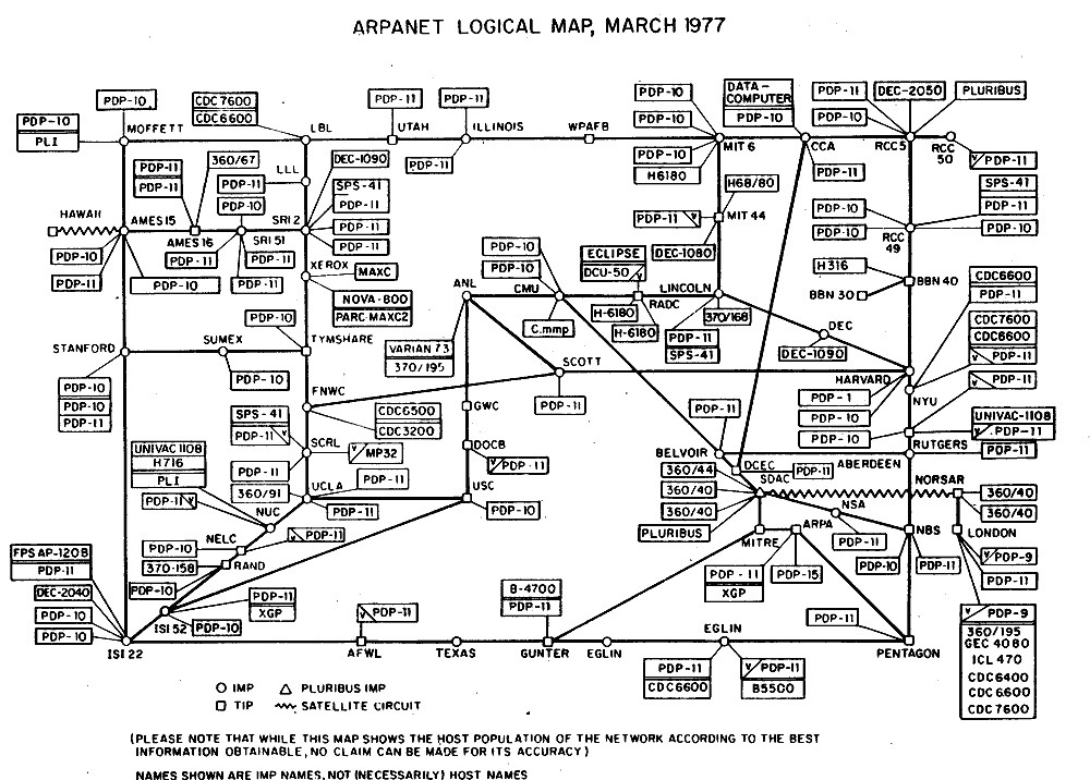
Map of Arpanet in 1977. Image Credit: Arpanet
Of course, the gulf between Arpanet and the modern web is yawning.
The UCLA-SRI connection took place at a then lightning-quick 50 kilobits per second; today’s internet can hit speeds some 20,000 times faster. Arpanet maxed out at around 100 nodes (or connected computers). Today’s internet is a network of networks comprising billions of nodes worldwide.
The implications of all this need no introduction: The internet has civilization-bending influence.
For all that, it’s still a rather abstract concept. To most people, the internet is its content: News, images, videos, music, messages, and memes. But all that content lives on and is served up by a sprawling mass of interlinked computers spanning the globe.
To really visualize the sprawl, you need to map the territory. Maps of Arpanet were fairly straightforward engineering schematics, but the modern web’s scale is far too great for a sheet of paper and some straight-edge lines and dots. Enter Barrett Lyon.
In 2003, Lyon was just finishing school and working as a hired hacker. Companies tasked him with rooting out vulnerabilities in their systems, and he’d developed mapping tools for the job. His electronic sniffers would trace a network’s lines and nodes and report back what they found. Why not set them loose on the mother of all networks, he thought? So he did.
The resulting visualization recalled grand natural patterns, like networks of neurons or the large-scale structure of the universe. But it was at once more mundane and mind-boggling—representing, as it did, both a collection of mostly standard laptop and desktop computers connected to servers in run-of-the-mill office parks and an emerging technological force that was far more than the sum of it parts.
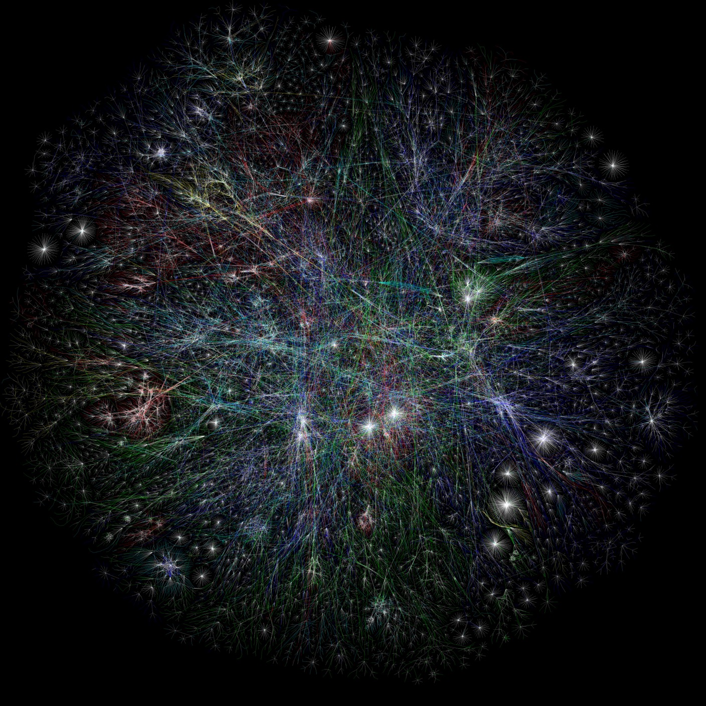
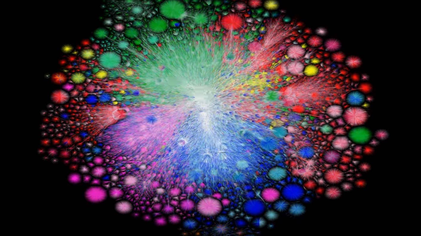
Lyon's first full map of the internet, November 22, 2003. Image Credit: The Opte Project
In 2010, Lyon updated his map using a new method. Instead of the traceroutes he used in 2003, which aren't always accurate, he turned to a more precise mapping tool using route tables generated by the Border Gateway Protocol (BGP), the internet's main system for efficiently routing information. And now, he’s back with a new map based on BGP routes from the University of Oregon's Route Views project. Only this time the map moves: It's a roughly 25-year time-lapse of the internet’s explosive growth.
It’s a mesmerizing, almost organic visual. But it’s also more than that.
Be Part of the Future
Sign up to receive top stories about groundbreaking technologies and visionary thinkers from SingularityHub.

The colors map to regions: North America (blue), Europe (green), Latin America (purple), Asia Pacific (red), Africa (orange), and the internet backbone (white). The lines connect nodes; and the starbursts are internet providers for public, private, and government networks (think AT&T or Comcast or the military). The middle is the most highly connected region, and the periphery the least.
Because it’s animated over time, you can watch different regions come online. Equally, you can see regions blink on and off. Some countries, like China and Iran, linger on the outskirts, with fewer links in and out. This, Lyon notes, enables greater control of national networks, like, for example, China’s Great Firewall. During the Iranian protests in 2019, the government shut down most of the internet—connectivity fell to just five percent of average—and this is clearly apparent in the visualization. Big Iranian networks just disappear.
Most obvious, and dramatic, is just how much the internet has grown. There are now almost five billion people online. The remaining few billion will likely log on in the next decade.
“When I look at it, each one of those little squiggles and wiggles is human beings doing something,” Lyon recently told Wired. “People actually using the network, building the network, literally going across oceans and mountains with fiber optic cables and digging ditches. All of that work is reflected in one snapshot.” Clearly, a lot's changed since 1997—but in a sense, we're still just getting started.
Update (3/2/2021): Clarified that the Border Gateway Protocol (BGP), the internet's main routing protocol, can be used to map the internet but isn't itself a mapping tool.
Image Credit: Barrett Lyon / Opte

Jason is editorial director at SingularityHub. He researched and wrote about finance and economics before moving on to science and technology. He's curious about pretty much everything, but especially loves learning about and sharing big ideas and advances in artificial intelligence, computing, robotics, biotech, neuroscience, and space.
Related Articles

This DNA Switch Could Control Molecular Machines

These Seven AI Rings Translate Sign Language in Real Time

AI Companies Are Betting Billions on AI Scaling Laws. Will Their Wager Pay Off?
This DNA Switch Could Control Molecular Machines
These Seven AI Rings Translate Sign Language in Real Time
AI Companies Are Betting Billions on AI Scaling Laws. Will Their Wager Pay Off?
What we’re reading