A World of Tweets: Putting the Tweetsphere on the Map

Share
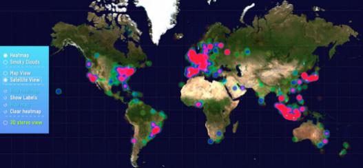
There’s too much damn information in the world! If you haven’t been bored when reading about random statistics from the internet then you’re probably a futuristic artificial intelligence. (In which case, welcome, Overlord). Making boring data look awesome is difficult, but a pair of designers in Milan have given us a tool to help. A World of Tweets from Frog Design is an evolving map of the tweetsphere. Geotagged tweets appear as drops of heat that accumulate on the globe. You can even switch the map to a 3D display if you have your pair of Red/Cyan glasses handy. There’s something about watching the East Coast heat up around lunchtime every day that seems deeply satisfying. I may not know what every tweet is saying, but I do know how the tweet traffic itself is changing. Very cool. This is more evidence that great design can make almost anything fun to look at. Watch a brief demo I made of the site in the video below.
I’m a sucker for clean crisp presentations of data analysis, and A World of Tweets has that in spades. Creaters Carlo Zapponi and Andreas Markdalen have provided a beautiful way to visualize the tweetsphere. Of course, it'd be just as thrilling if we were looking at Facebook status updates, cancer-related mortality, or Justin Bieber album sales. It's not the data, but the presentation that really makes A World of Tweets so cool.
Be Part of the Future
Sign up to receive top stories about groundbreaking technologies and visionary thinkers from SingularityHub.

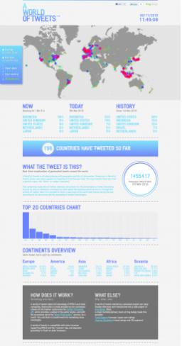
That's not to say tweets can't be important. We’ve discussed how analysis of social networks, and the people who comprise them, can allow scientists to predict the spread of deadly diseases and habits. There’s also a chance that Twitter could be used to accurately predict fluctuations in the stock market. The most promising application may arrive when projects like A World of Tweets are combined with Twitter projects that provide sentimental analysis. We wouldn’t just know where people were tweeting, we’d know (roughly) how they are feeling while they tweet. AWOT already combines two other data management technologies: Yahoo! Placemaker and Twitter Streaming API. Plugging in data from a site like TweetFeel shouldn’t be that difficult. Someone needs to get on this...
In the future, I hope we get more of this kind of design. We have so much information constantly being thrown at us that it takes really good presentation and a 'wow' factor to make us sit up and take notice. In other words, there’s only “too much damn information in the world” if you don’t have a good way of understanding what you’re looking at. So go grab your 3D glasses, fire up A World of Tweets, and watch the millions of thoughts stream by. It’d be relaxing if it wasn’t so awesome looking.
[image credits: Carlo Zapponi & Andreas Markdalen Frog Design, Milan]
[sources: Frog Design]
Related Articles

OpenAI Agent Breaks Free and Hacks Hugging Face

Orbital Data Centers Are Seductive on Paper, but They Face Daunting Challenges in Reality

In the Scramble to Power AI, Investors Bet $140 Million on Data Centers at Sea
OpenAI Agent Breaks Free and Hacks Hugging Face
Orbital Data Centers Are Seductive on Paper, but They Face Daunting Challenges in Reality
In the Scramble to Power AI, Investors Bet $140 Million on Data Centers at Sea
What we’re reading